how to logo
vpro


visual identity, art direction, graphic design, video editing, social media, offline media
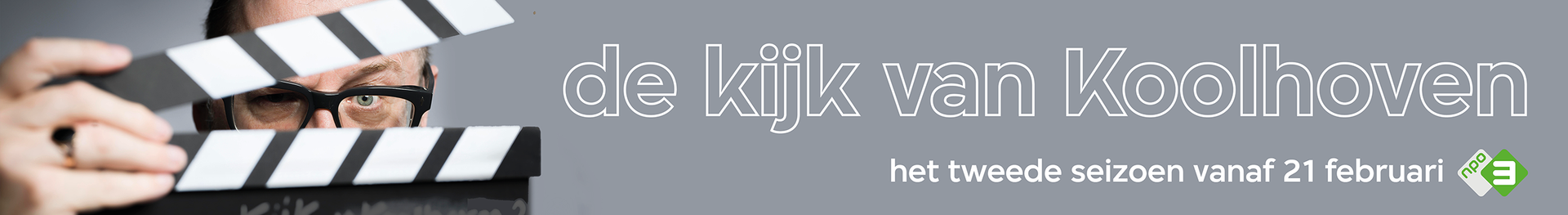
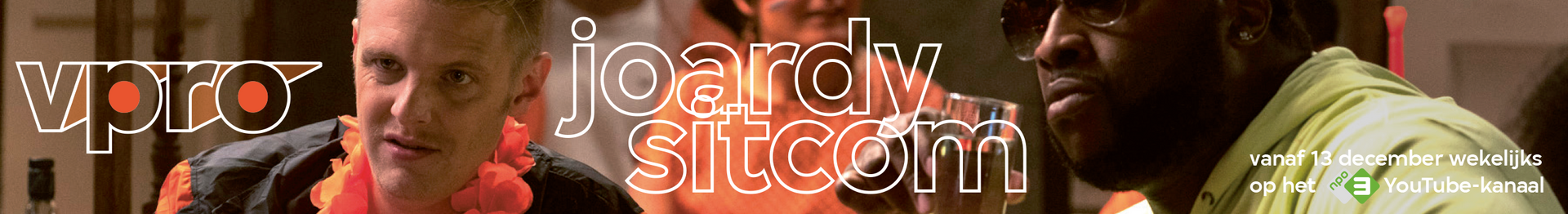
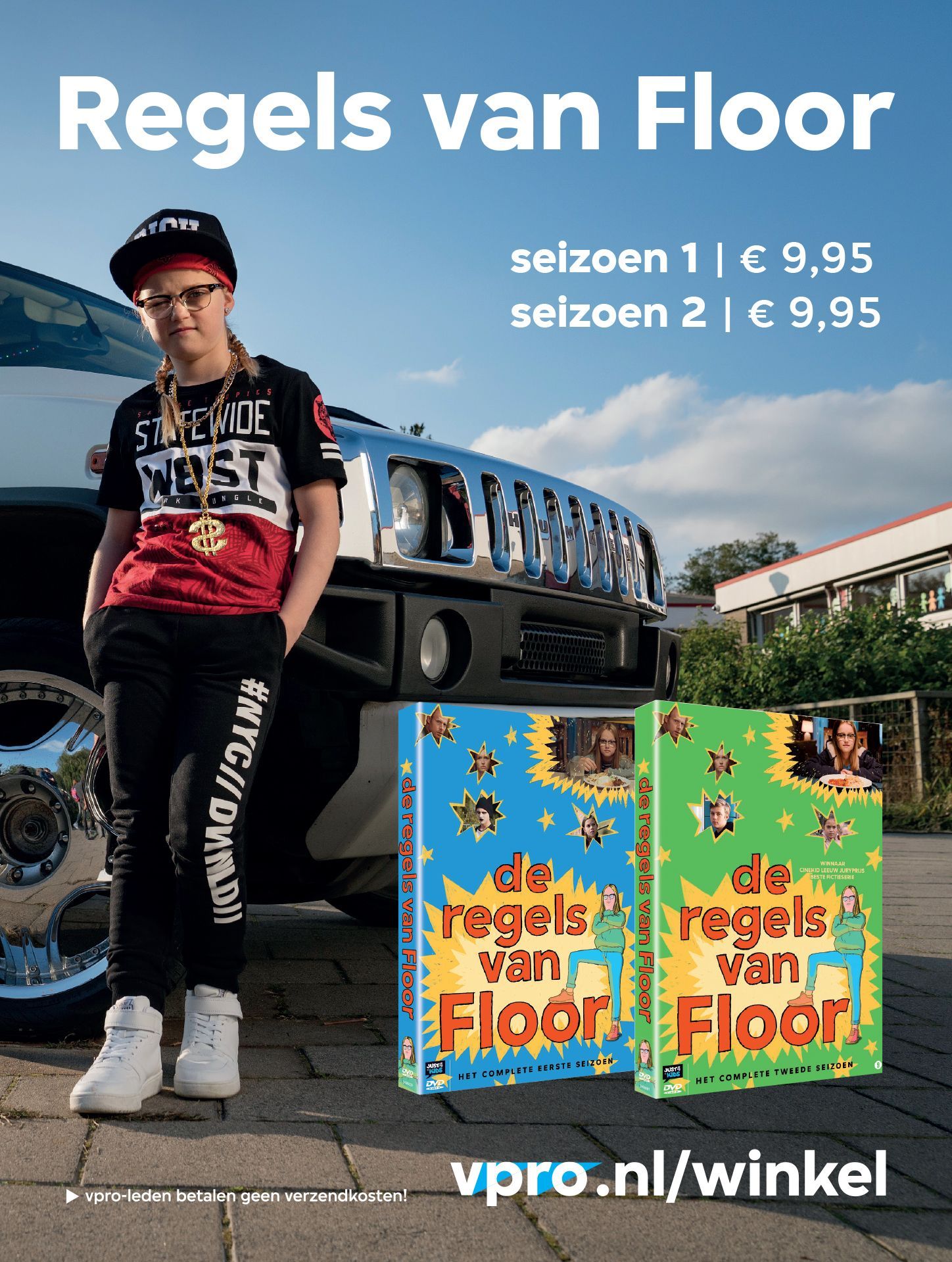
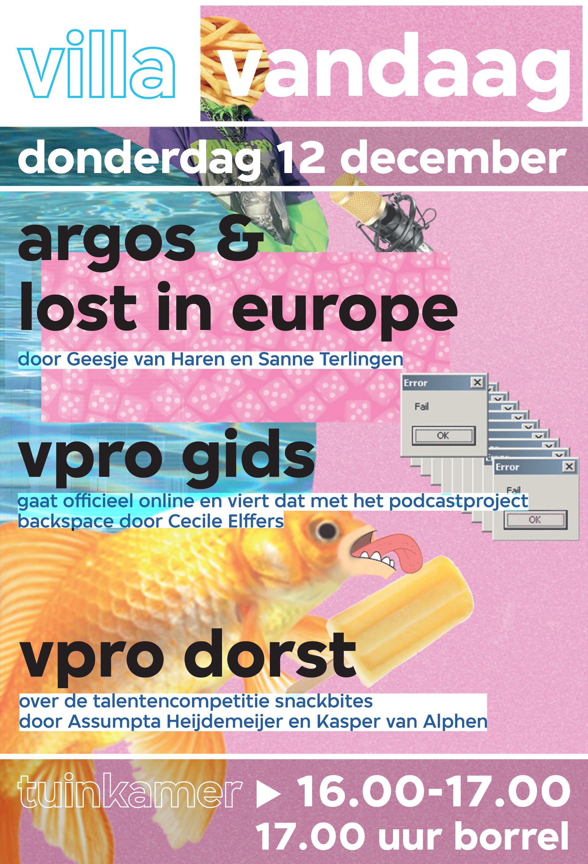
posters, advertisements, invitations, postcards, banners, brochures and the promovideo for the Waarom podcast, which I got a lot of credit for.
The VPRO is a modern, cross-media broadcasting organisation with a long track record. A pioneer since 1926, a cradle of iconic television and radio programmes, an incubator of innovation and talent, and a stage for idiosyncratic stories and storytellers.
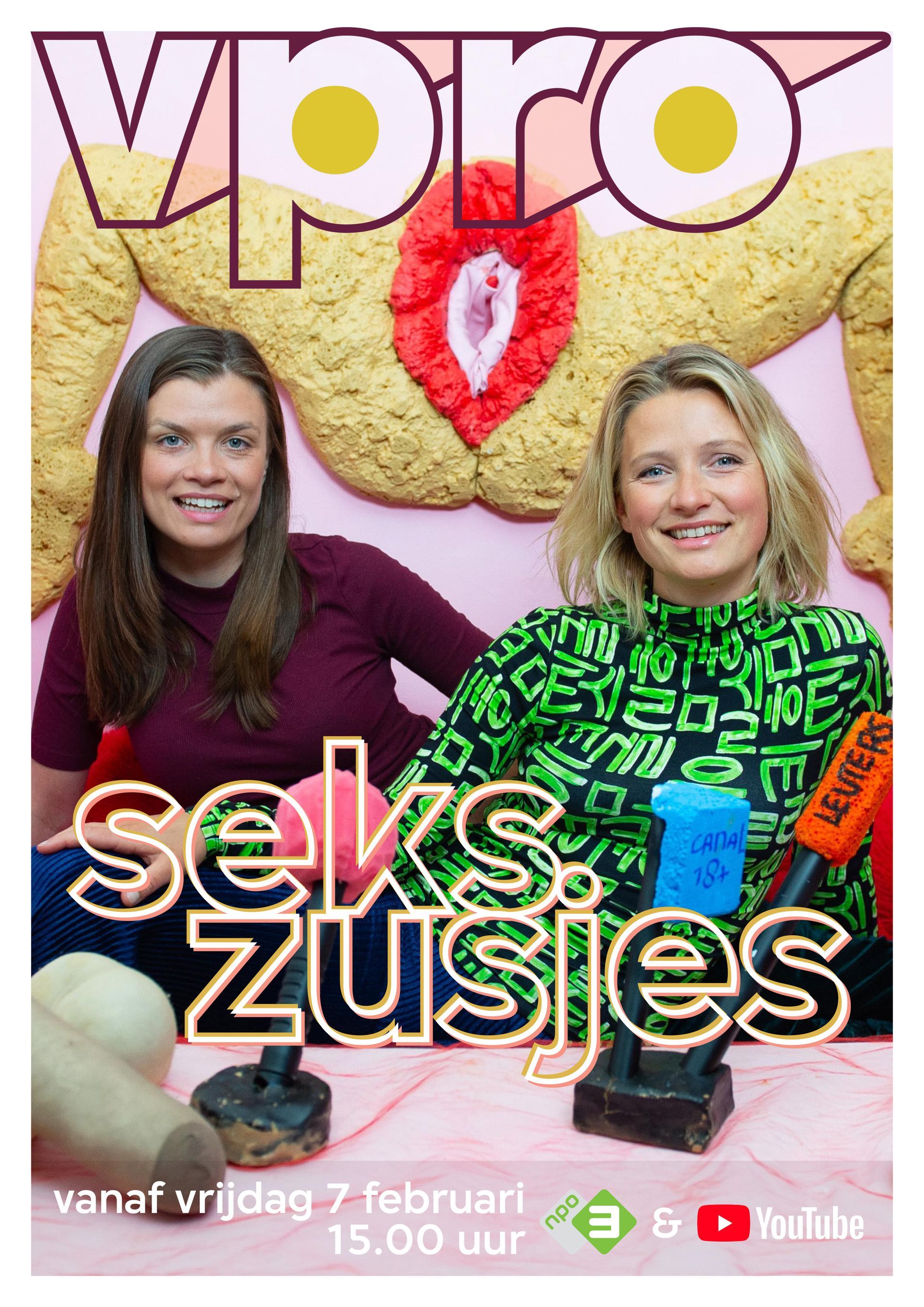
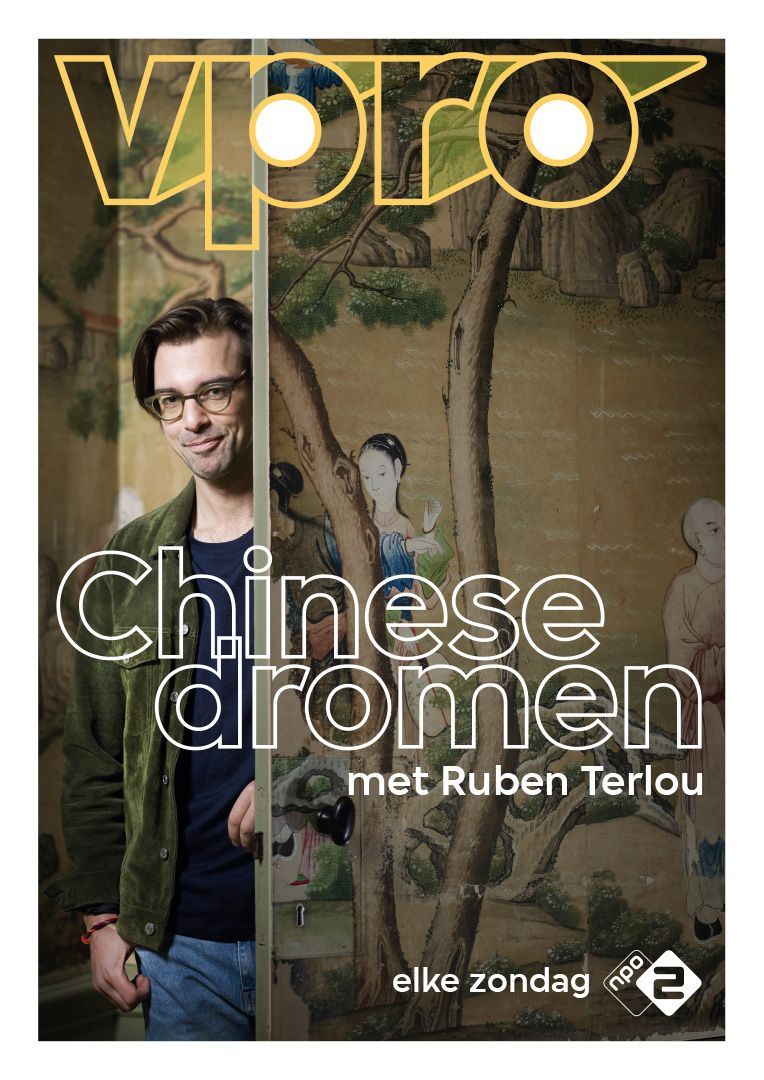
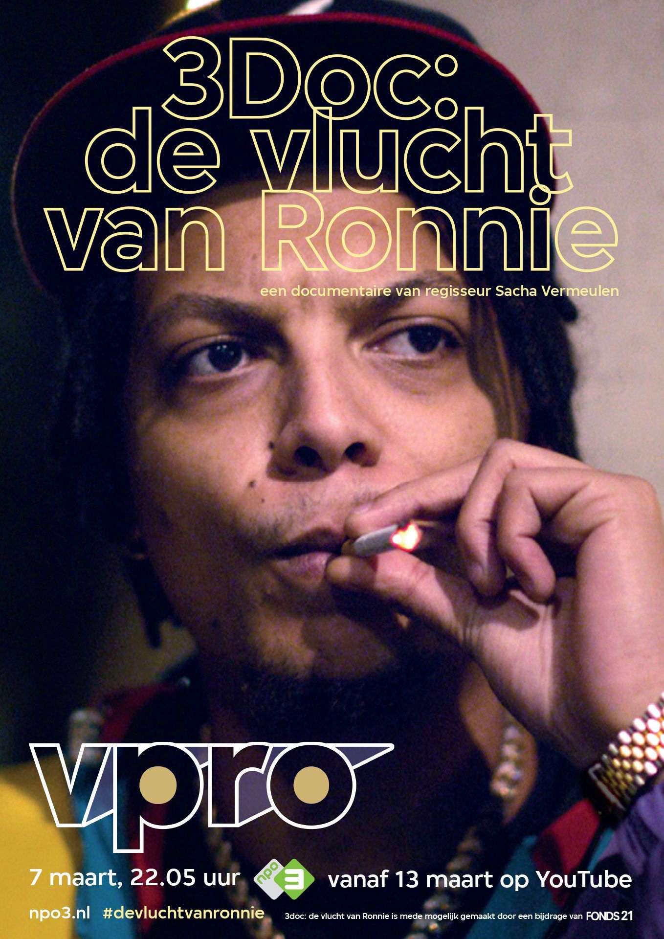
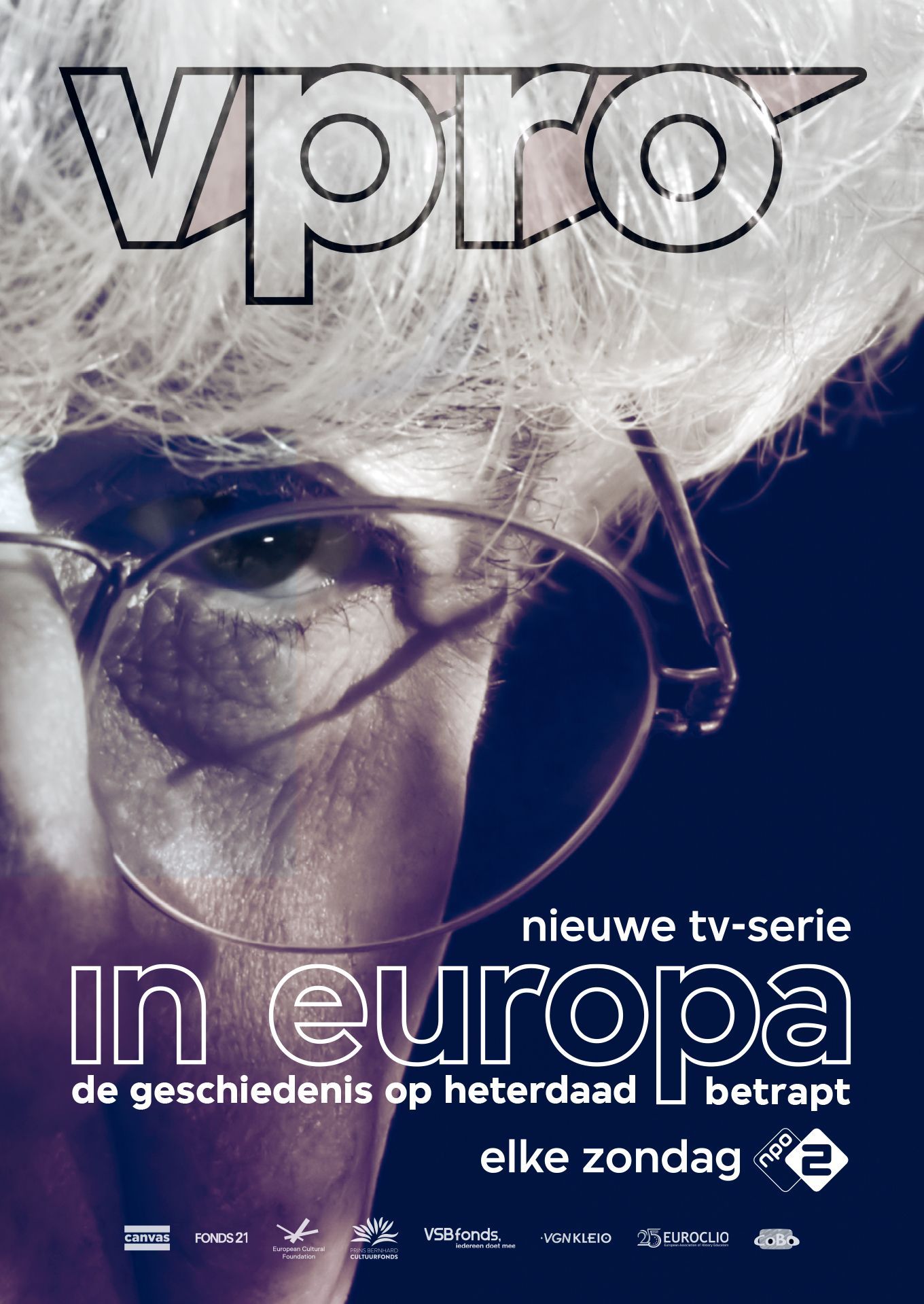
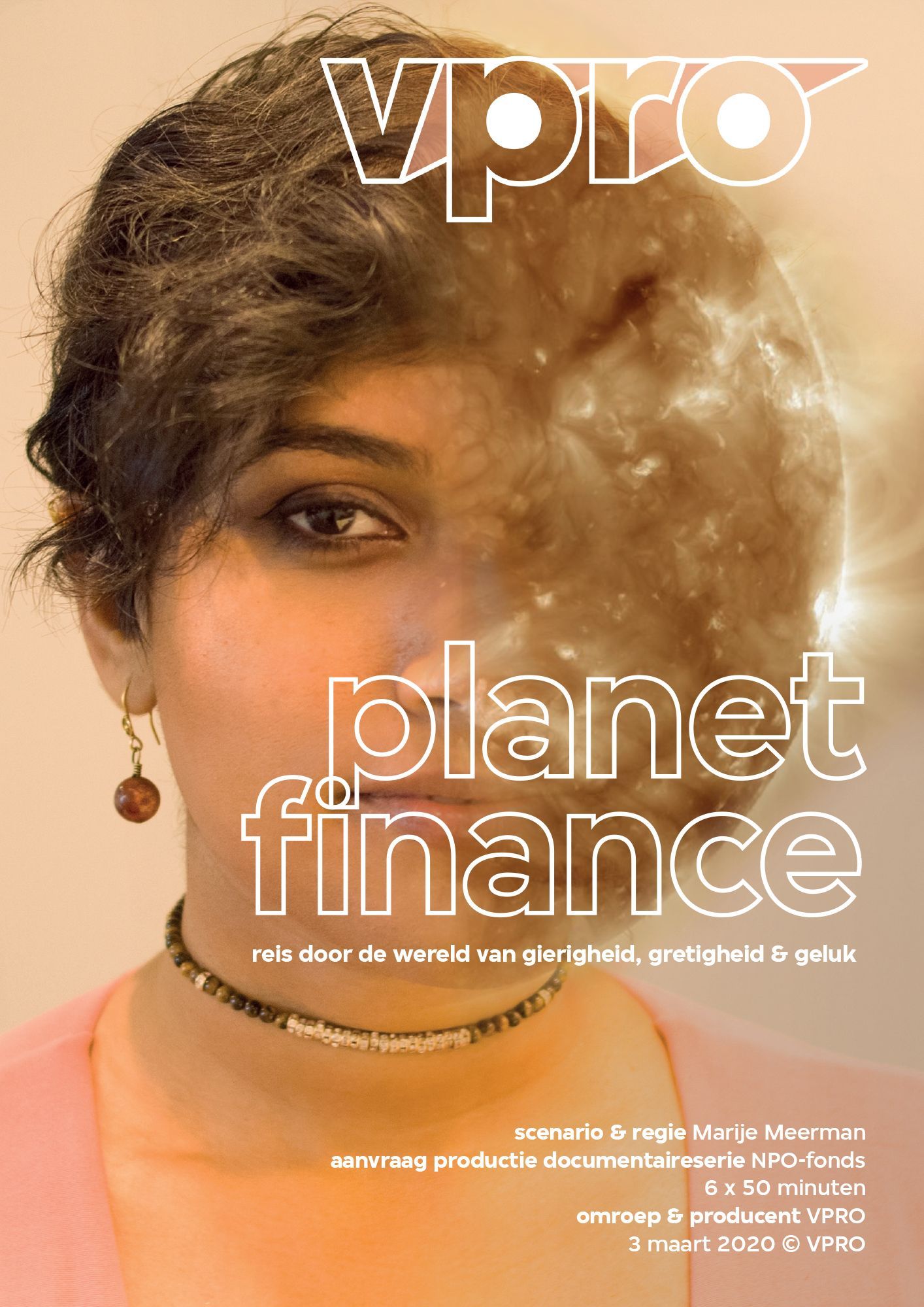
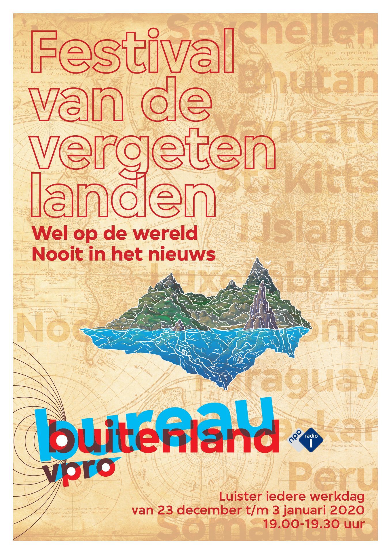
What you see on this page is less than 1% of what I've done while working for VPRO. As interim art director, I was supposed to stay for a few weeks, which turned out to be a year. In addition to all the day-to-day business, by the end of October 2019 we were going to announce and introduce the new logo - or the '2.0' version - and the new open font based on Simplistic Sans, both designed by Thonik.
I had the pleasure of being involved in the process, which allowed me to do a lot of background experimentation in the months leading up to the announcement. Since I've done work for almost every department at VPRO, I had a good understanding of how the logo and new font could be used when designing the style guide with Thonik. It was a wonderful playground for me where I had a lot of freedom (thank you Diederick and Nicole). It's also where you realise how deep the rabbit hole goes when it comes to the logo and its implementation throughout the organisation. Together with Diederick Hoekstra, Head of Public Relations & Marketing, we drew up a plan on how to roll out the logo throughout the organisation and the people involved, inside and outside the organisation.